Welcome to my Blog
Tuesday, 30 March 2010
Shoot Location
The reason why I liked our location so much was that we didn’t have to waste time traveling. I really liked the set up of our location, as the height of the building was good enough to film the paper falling down for the credits at the start of our thriller. It also had to be high enough so we could film our dummy falling for a second so the viewer could see what it was.
Shoot Day
On our Shoot day we had to meet in the edit suite at 9am, once Luke and Matt had arrived we then were asked to show our storyboard so they could get an idea of what we wanted to film. Once our media teachers had talked it over with us to make sure that we were happy with what we wanted to achieve on the shoot day. We then wanted to make sure the dummy was correctly set up, as we didn’t want it to break on the first jump!
Once I had finished all of the non-revealing shots we then decided to film as much paper as possible so had a lot of choice to choose from. The reason why I wanted to film the falling stock Certificates so much is because we could then get a different shot of the same paper in the air. I wanted to film the paper falling, as it was a really good idea for the start of the film for the producer and the credits with the paper falling in the background.
After I had finished filming the paper falling I wanted to get the shots on the roof so you could se how high up he was. The reason I chose a high building to shoot from was that it creates a sense of fear of falling and hitting the ground. When we were on the roof I wanted to film all the different angles so we had as much choice as possible.
On our shoot day I really enjoyed doing all of the camera work, as it was such a good experience to how I should shoot a film. It was really interesting to how I could film something that I would later edit on After Effects.
Thriller Idea
Our first Idea wasn’t that good at the start so we decided to chop and change parts of our opening sequence so it would fit better to our target. After a while we had changed our idea so much we decided to get rid of it completely and start a fresh idea.
Our thriller idea that we came up with was to be able to still use the props that we had bought so it wasn’t a waste of money and time. But to be able to still use the dummy that we made out of newspaper and clothing items.
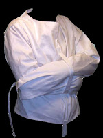
For our thriller idea it would start off a man in a mental hospital where he then escapes out of a padded cell after assaulting a doctor and takes the keys. He then tries to find the stock certificates of himself, and goes through all the people that are at the mental hospital. You then see him running up to the roof of the building. He stands on the edge of the roof and starts throwing the paper off one side of the building. Each time he looks at the paper and sees the stock certificate for his name.
The last page of paper his name is shown on the stock certificate saying how he owned a multi millionaire business. He then looks up to the vast view in front of him and then steps up onto the side of the building and jumps off. The camera is then shown to be in one of the windows in the hospital. The viewer would then see the title of the film (Gordon Experiment) on the horizon of the view.
The use of sound in my thriller would be shown as a mysterious and secretive light. I wanted to use these types of sound to hold tension in the audience but so I don’t give away the story too fast.
Props
 The prop list that we used in our thriller were:
Costume Design
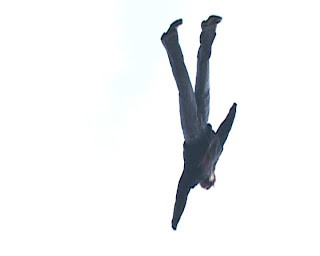
 For the costume design we needed to make sure that there was a graphic match with the actor and the Dummy that was going to be thrown off the roof. To do this we just switched the jacket and trousers onto the dummy.
Because I didn’t want my actor to be dressed up in a suit or nice clothing we had to make sure his clothes fitted our character correctly. This meant he had to be quite scruffy and made to look unusual. Because he was at a mental home before he jumped off the roof.
The clothes that I chose for my character had to be original to the style of my thriller idea to make sure that it was a match.
Monday, 29 March 2010
Pre-Production Process
For the Pre-Production process it was a very important stage in our group as it meant there was less time wasted on our shoot day. Using the Storyboard for our idea was very useful as it gave use clear idea of the sequence of shots and how we wanted it to look on the shoot day. Lots of our ideas were then changed during this process, which benefited to our sequence because we could improve from our original ideas in each storyboard we did. Our costume and props list were more organized as we had more props than usual as our first idea was changed. This turned out to be a credit as we had more props and costumes.
With the Pre-Production process I learnt that in film making planning the shots is a very long process but is essential for the organization to save time on shoot day and to know exactly what you want the sequence to be like.
More detail about Research Sources
I wanted to explain the research that I learnt from various opening sequences off You Tube. I wanted to get the information about the old ideas for the opening sequences so I would be able to come up with completely fresh ideas towards my Thriller. It was really useful as I found out how the credits and titles should be presented in the correct way.
I used the opening titles of creep and Scream, as they were the most well known horrors that were closest to my thriller idea.
Using old Opening Sequences for further research really helped me in deciding what shots I thought we should add in on the shoot day.
Adobe Photoshop Editing

Adobe Photoshop is a graphics-editing program developed and published by Adobe Systems. It is the current market leader for commercial bitmap and image manipulation software. It has been described as “An industry standard for graphics professionals”. Photoshop has strong ties with other Adobe software for media editing, animation and authoring the Photoshop Documents.
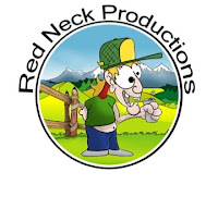
I wanted to use Photoshop to create my production logo and end title credits. Photoshop is a very easy and useful application for manipulating the Production Logo, as I was very able to make a cartoon character, and enhance all of the colours. To make the text bend around my logo design I wanted it to fit perfectly or not at all. In the text layout you can get the option to bend the perspective or alter the curve line so it would fit correctly to my logo.
Friday, 26 March 2010
Production Logo

To animate it I would use After Effects because it is really useful for animating. When I started to animate my character I found it quite hard to know how to animate it.
Because I wanted to put the Text 'Red Neck Productions' on or around my logo that I designed. To put the text on my Production logo I used Adobe Photoshop CS4. I really enjoyed making the character on Photoshop, as it was really interesting knowing how they make the Production logos. Because my Logo that I designed looked quite plain and boring I decided to use a round border to mask off the edge line of the Scenery. I wanted the colors to stand out so they looked better; I re-painted all of the colors and then used dark and light tones for the colors.